Understanding Color Psychology
The Basics of Color and Mood
- When it comes to understanding color psychology, it’s essential to grasp the basics of how different colors can evoke specific emotions and moods. Colors are not just visual stimuli; they have the power to influence our feelings and behaviors. For example, cool tones like blues and greens tend to create a sense of calm and tranquility, making them ideal for bedrooms or relaxation spaces. On the other hand, warm colors like reds and yellows can evoke feelings of energy and warmth, making them suitable for areas where social interaction occurs, such as living rooms or dining spaces.
Cultural and Personal Influences on Color Perception
- Color perception is not solely dictated by universal meanings; it can also be influenced by cultural and personal factors. While certain colors may have general associations, such as red symbolizing passion or danger, the interpretation of colors can vary across different cultures. For instance, white is traditionally associated with purity and weddings in Western cultures, while it signifies mourning in some Eastern cultures.
- Our personal experiences and preferences also play a significant role in how we perceive colors. A color that evokes happiness for one person may bring about feelings of sadness for another based on individual associations. Understanding these nuances can help us choose colors that resonate with our unique preferences and cultural backgrounds when designing our living spaces.
The Impact of Color In Home Interiors
1. Psychological Effects of Color on Emotion and Behavior
Exploring the psychological effects of color on emotion and behavior reveals a fascinating aspect of interior design. Colors have the power to influence our feelings and actions within a space. For instance, serene blues and greens can promote a sense of calmness and relaxation, while vibrant reds and yellows can evoke energy and excitement. By being mindful of these effects, one can strategically choose colors to create specific moods in different areas of their home.
2. The Significance of Room Function and Color Choice
Understanding the significance of room function in relation to color choice is crucial for creating harmonious living spaces. Different rooms serve distinct purposes, and colors can enhance or detract from their intended functions. For example, soothing tones like soft blues and neutrals are ideal for bedrooms to encourage restful sleep, while lively hues are well-suited for social areas like the living room to promote a convivial atmosphere. By aligning color choices with room functions, one can optimize the overall design and ambiance of their home.
Creating Mood with Color: Room by Room Guide
Invigorating Spaces with Warm Tones
- In rooms where I want to create a sense of energy and vibrancy, I opt for warm tones like reds, oranges, and yellows. These colors are known for their stimulating effects and can be perfect for spaces like the kitchen or home office. By incorporating shades of red for vitality, orange for enthusiasm, and yellow for optimism, I can cultivate a lively atmosphere that fosters productivity and creativity.
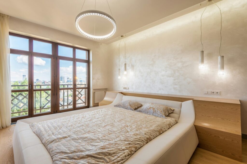
Calming Areas with Cool Hues
- When I aim to establish a tranquil and serene ambiance in certain areas of my home, I turn to cool hues such as blues, greens, and purples. These colors have a soothing quality that is ideal for spaces like the bedroom or reading nook. Utilizing shades of blue for relaxation, green for harmony, and purple for luxury, I can create a peaceful retreat that promotes rest and relaxation after a long day.
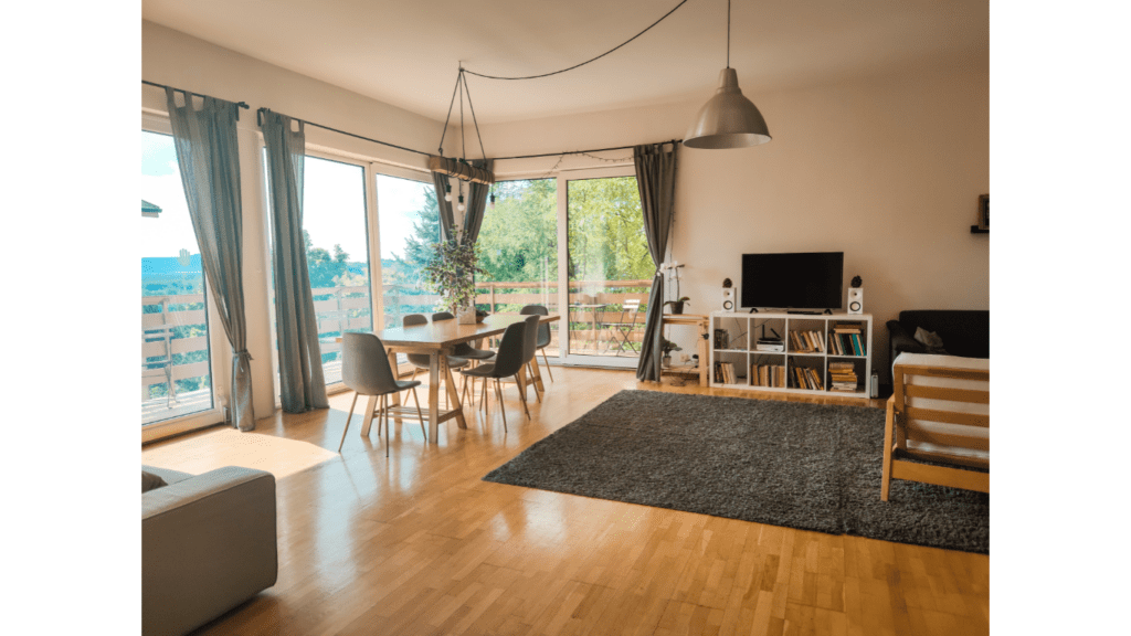
Neutral Colors for Flexibility and Balance
- For rooms that require versatility and a sense of balance, neutral colors are my go-to choice. Shades like white, beige, and gray serve as a blank canvas, allowing me to add accents of any color to suit the mood or style I want to achieve. By using neutral tones as a base, I can easily change the look and feel of a room by incorporating different colored accessories or textiles, ensuring a harmonious and adaptable space that can evolve with my preferences.
Tips for Using Color to Enhance Your Home
1. Balancing Color Schemes for Harmonious Interiors
To create a harmonious interior, I recommend balancing color schemes strategically. By incorporating a mix of warm, cool, and neutral colors throughout your home, you can achieve a well-rounded design that promotes a sense of equilibrium. For instance, pairing a bold accent wall in a warm tone with softer neutral furnishings can create a visually appealing contrast without overwhelming the space. Remember, the key is to maintain a balance to ensure that no single color dominates the room, creating a soothing and balanced ambiance.
2. Incorporating Color Through Accessories and Decor
When enhancing your home with color, I suggest incorporating hues through accessories and decor items. Vibrant throw pillows, colorful rugs, art pieces, and decorative accents can add pops of color to your space without the commitment of painting entire walls. These elements allow you to experiment with different color palettes and easily switch them out to refresh your home’s look seasonally or as your style preferences evolve. By layering colors through accessories, you can inject personality and warmth into your living spaces while maintaining versatility.
3. Lighting and Its Relationship with Color
Lighting plays a crucial role in how colors are perceived in a space. Natural light can enhance the vibrancy of colors, while artificial lighting can alter their tones. When selecting paint colors or decor items, consider how different lighting conditions throughout the day will affect their appearance. Opt for a mix of lighting sources, including overhead lights, floor lamps, and task lighting, to create a layered and dynamic lighting scheme that complements your chosen color palette. By understanding the relationship between lighting and color, you can ensure that your home always looks its best, day or night.
Trending Color Palettes and Their Psychological Impact
Popular Color Trends and Moods They Create
Exploring popular color trends allows me to stay updated on the latest choices to transform my home. Utilizing trending colors can significantly impact the overall vibe of a room. For instance, soft pastel colors, such as blush pink and serene blue, are currently in vogue for creating a calming and gentle atmosphere. On the other hand, bold and vibrant hues like deep emerald green or spicy mustard yellow can add a sense of drama and energy to a space. By keeping an eye on color trends, I can easily adapt my home’s ambiance to reflect contemporary styles and moods.
How to Integrate Trending Colors Without Overdoing It
When incorporating trending colors into my home decor, I focus on a balanced approach to prevent overwhelming the space. I start by introducing trending colors through smaller accent pieces like decorative cushions, rugs, or curtains. These elements allow me to experiment with new hues without committing to a full room makeover. Additionally, I blend trending colors with existing neutrals or classic shades to maintain harmony in my decor. By layering colors strategically and considering the overall color scheme, I create a cohesive look that seamlessly integrates trending hues into my home design.